Sarai Garcia

Web to Case Creation

Overview

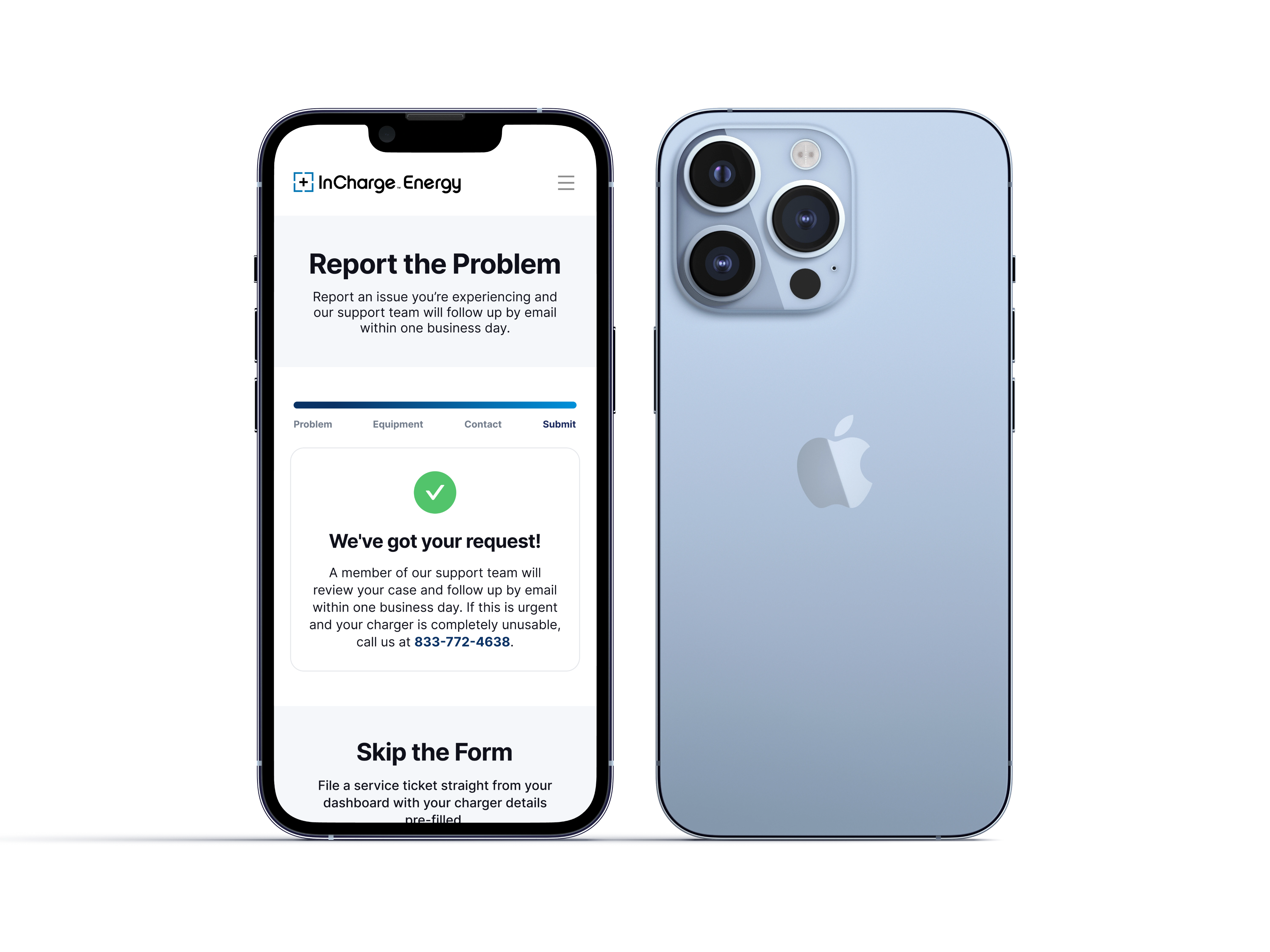
Redesigned InCharge Energy's customer support form to reduce friction for site managers and charger owners reporting issues. Replaced a long, single-page form with a short, guided flow that leads with the problem instead of contact information, making it faster to open a support case and easier for the support team to act on.

Role

UX/UI Designer (Intern), two-person design team, in collaboration with my manager

Project Scope

  • UX/UI Design
  • Component & Design System Work
  • Responsive Design (Desktop + Mobile)
Problem

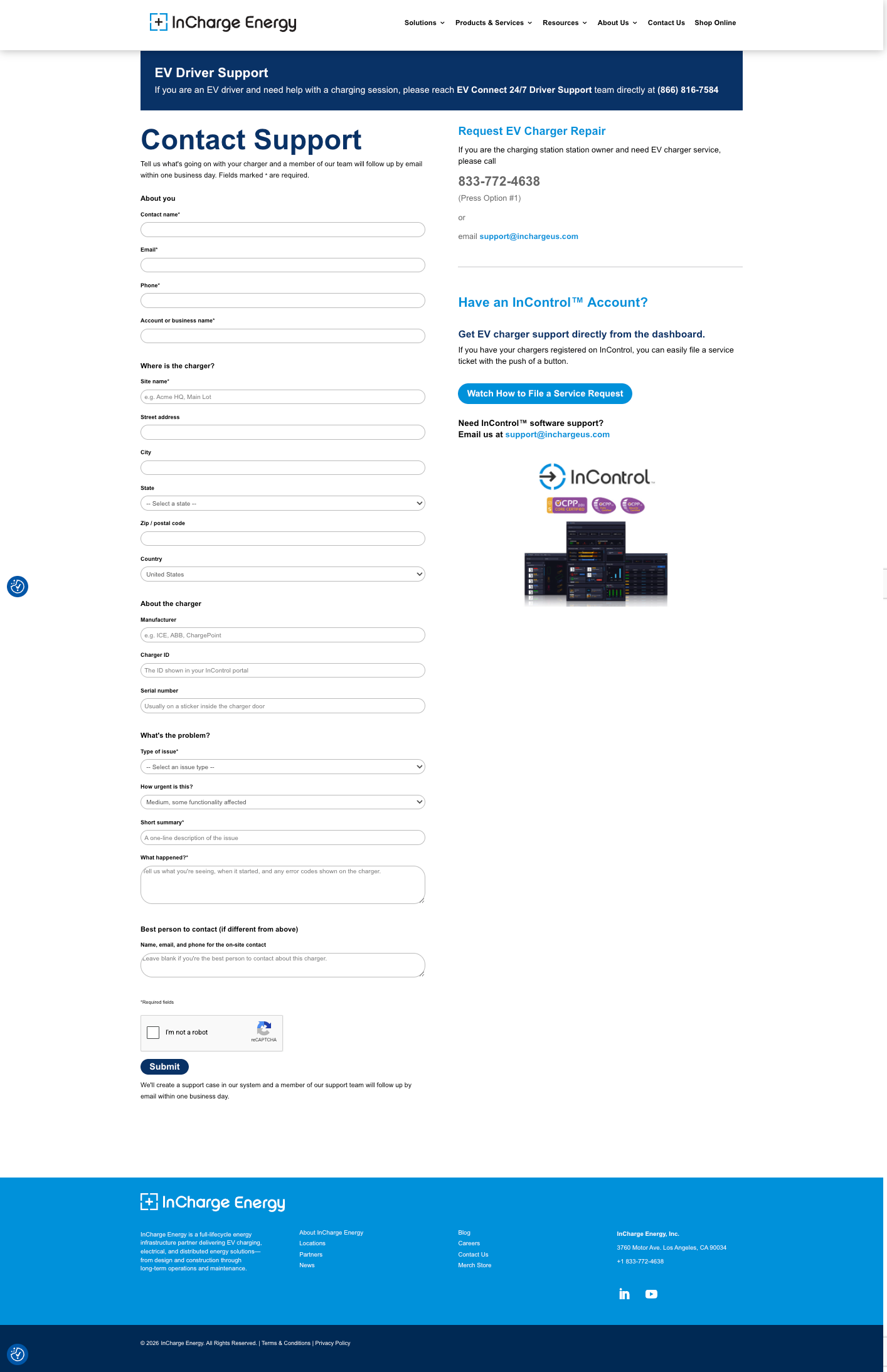
  • The existing support form is a single long page with 18 fields, asking for contact and company information first before the problem
  • Contact-first ordering and multiple required fields up front create friction and excessive scrolling for site managers who could be on their phone, on-site.
  • The support team flagged incomplete submissions and drop-off as recurring problems.

Process

  • Problem framing and audit of the current form
  • Prioritizing fields and deciding what to cut
  • User flow that organized step sequencing
  • Wireframing
  • Component building: step indicator and form fields
  • Responsive design for desktop and mobile

Research/Key Insights

  •  Asking for contact details before the problem increases abandonment; users are most motivated to describe the issue first.
  • Fewer required fields and clearer sequencing improve both completion and case quality.
  • Misrouted EV drivers were entering the case queue meant for site managers, creating a different flow for them early protects both audiences and reduces support load.

Design Solution

Step 0: Router

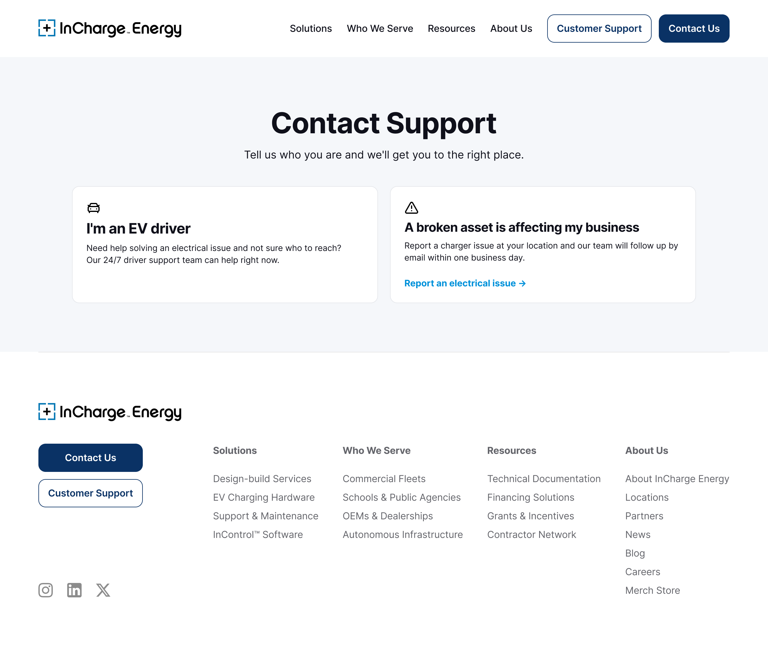
  • Step 0 Router: sorts EV drivers to 24/7 driver support before they enter the site-manager case form.
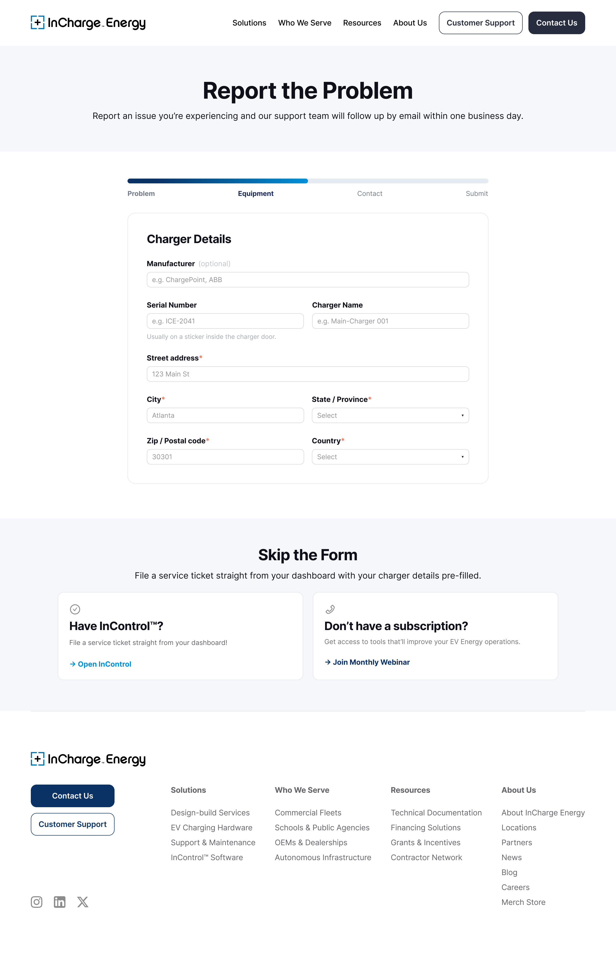
  • Section below site manager form allows for subscribed users to create cases within InControl’s dashboard, removing the need for the form with prefilled details from the user’s account.

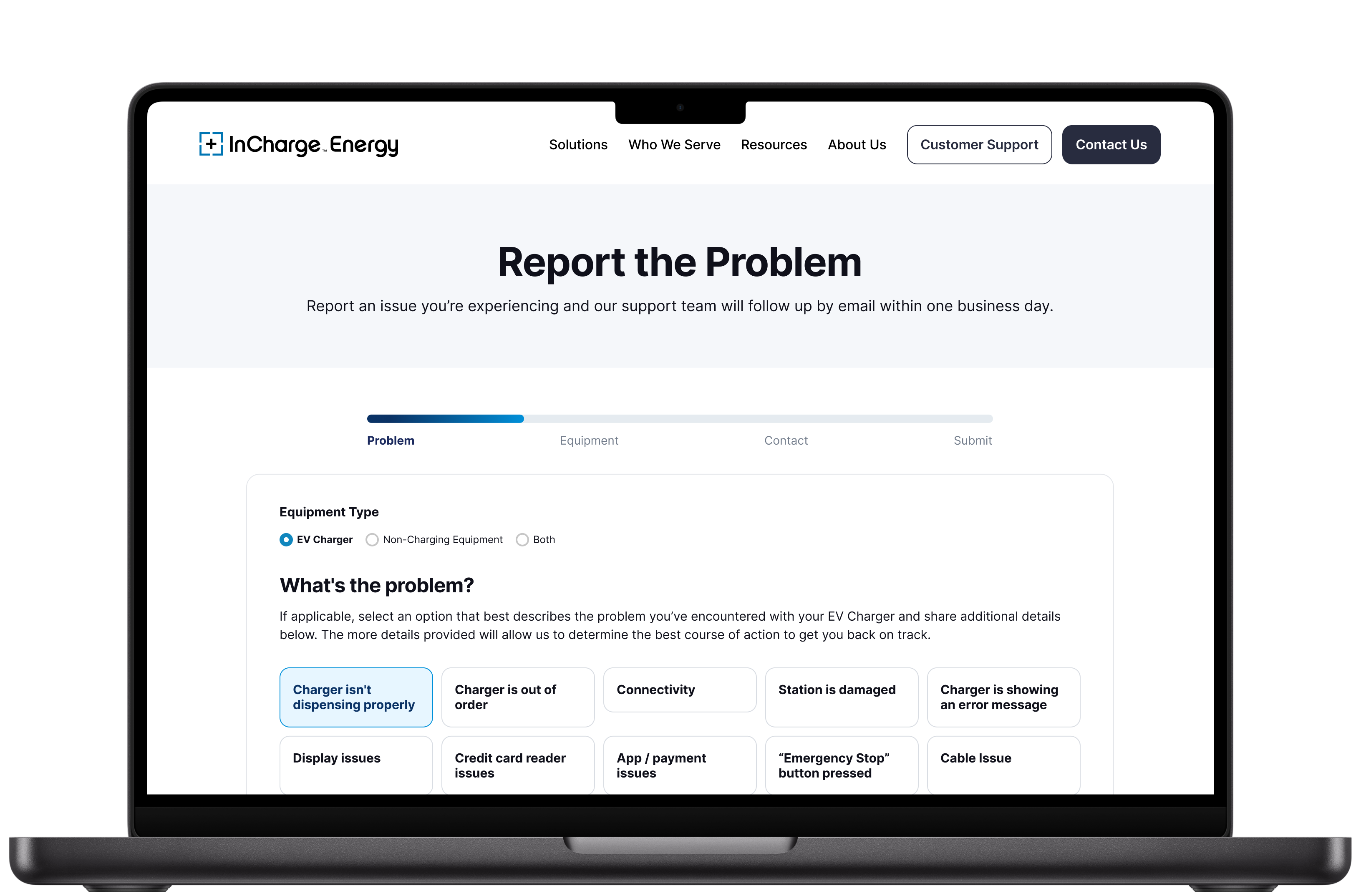
Step 1: Problem First Order

  • In the new flow, users describe the issue in Step 1; contact information is collected last, unlike the original form wherecontact information was collected first.
  • Removed self-rated urgency and redundant fields for less friction caused by multiple steps .

Step 2: Clear Case Details

  • Clear details for charger and location allows support to accurately and effectively create cases from the web support form.

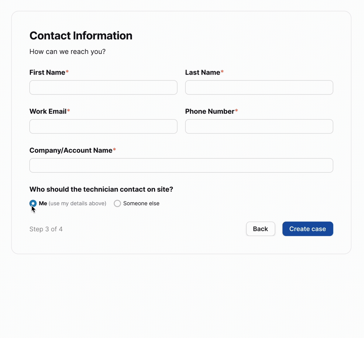
Step 3: On Site Contact Reveal:

  • On-site contact handling: if a different person should meet the technician, the form reveals fields for that on-site contact, saving the support team a follow-up.

Step 4: Completion

  • Completed progress bar and checkmark to clearly communicate that the form has been completed.

Branding/Design System

  • Built a reusable step-progress component with a variant for each step.
  • Matched InCharge's brand system (navy #0F1729, electric blue #1554AD) and designed within the site's existing Divi build constraints.
  • Created a custom “electrical asset” icon in the Lucide icon style used across the product.

Impact

  • New flow leads with the problem, designed to reduce early abandonment
  • Routes other user groups away from this queue to their proper support path
  • Collects cleaner, structured case data by dividing the form into 4 sections.
  • Works responsively for mobile first users

Reflections/

Considerations

This project strengthened my ability to reduce friction in a real environment. It allowed me to test my abilities to design within an existing brand system and platform, and balance user needs against support/operations needs. Iterating with my manager and presenting the work to other leadership strengthened how I frame design decisions around impact.

Back to Top

Reach out to me! @saraisstudio

Web to Case Creation

Overview

Redesigned InCharge Energy's customer support form to reduce friction for site managers and charger owners reporting issues. Replaced a long, single-page form with a short, guided flow that leads with the problem instead of contact information, making it faster to open a support case and easier for the support team to act on.

Role

UX/UI Designer (Intern), two-person design team, in collaboration with my manager

Project Scope

  • UX/UI Design
  • Component & Design System Work
  • Responsive Design (Desktop + Mobile)
Problem

  • The existing support form is a single long page with 18 fields, asking for contact and company information first before the problem
  • Contact-first ordering and multiple required fields up front create friction and excessive scrolling for site managers who could be on their phone, on-site.
  • The support team flagged incomplete submissions and drop-off as recurring problems.

Process

  • Problem framing and audit of the current form
  • Prioritizing fields and deciding what to cut
  • User flow that organized step sequencing
  • Wireframing
  • Component building: step indicator and form fields
  • Responsive design for desktop and mobile

Research/Key Insights

  •  Asking for contact details before the problem increases abandonment; users are most motivated to describe the issue first.
  • Fewer required fields and clearer sequencing improve both completion and case quality.
  • Misrouted EV drivers were entering the case queue meant for site managers, creating a different flow for them early protects both audiences and reduces support load.

Design Solution

Step 0: Router

  • Step 0 Router: sorts EV drivers to 24/7 driver support before they enter the site-manager case form.
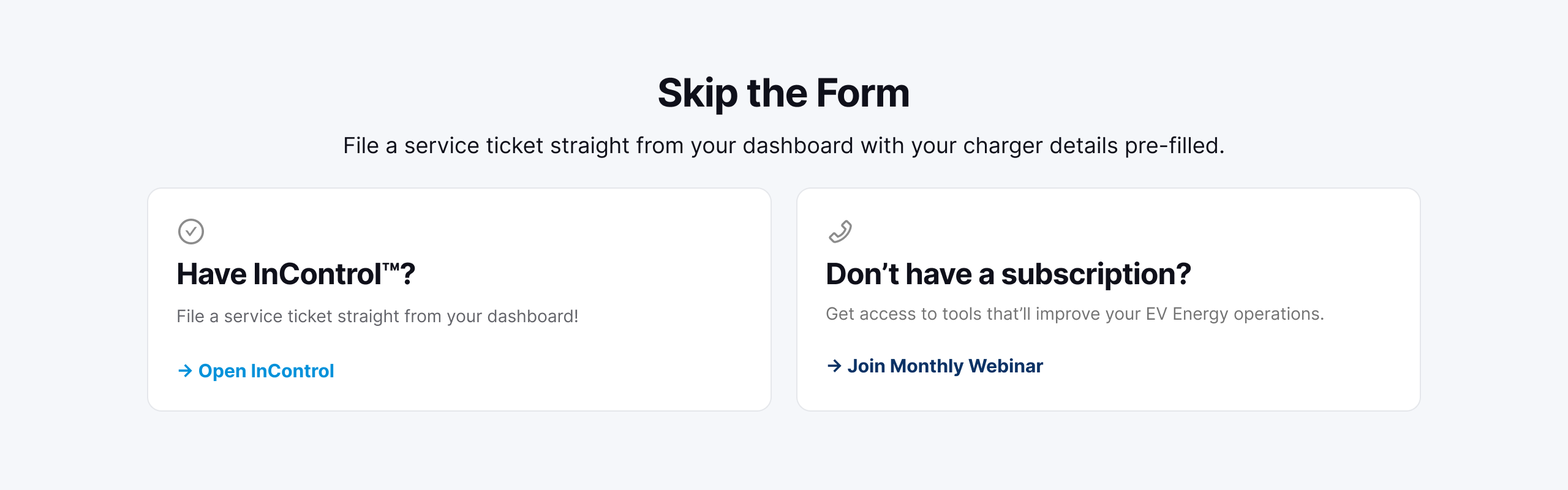
  • Section below site manager form allows for subscribed users to create cases within InControl’s dashboard, removing the need for the form with prefilled details from the user’s account.

Step 1: Problem First Order

  • In the new flow, users describe the issue in Step 1; contact information is collected last, unlike the original form wherecontact information was collected first.
  • Removed self-rated urgency and redundant fields for less friction caused by multiple steps .

Step 2: Clear Case Details

  • Clear details for charger and location allows support to accurately and effectively create cases from the web support form.

Step 3: On Site Contact Reveal:

  • On-site contact handling: if a different person should meet the technician, the form reveals fields for that on-site contact, saving the support team a follow-up.

Step 4: Completion

  • Completed progress bar and checkmark to clearly communicate that the form has been completed.

Branding/Design System

  • Built a reusable step-progress component with a variant for each step.
  • Matched InCharge's brand system (navy #0F1729, electric blue #1554AD) and designed within the site's existing Divi build constraints.
  • Created a custom “electrical asset” icon in the Lucide icon style used across the product.

Impact

  • New flow leads with the problem, designed to reduce early abandonment
  • Routes other user groups away from this queue to their proper support path
  • Collects cleaner, structured case data by dividing the form into 4 sections.
  • Works responsively for mobile first users

Reflections / Considerations

This project strengthened my ability to reduce friction in a real environment. It allowed me to test my abilities to design within an existing brand system and platform, and balance user needs against support/operations needs. Iterating with my manager and presenting the work to other leadership strengthened how I frame design decisions around impact.

Back to Top

Reach out to me! @saraisstudio

Web to Case Creation

Overview

Redesigned InCharge Energy's customer support form to reduce friction for site managers and charger owners reporting issues. Replaced a long, single-page form with a short, guided flow that leads with the problem instead of contact information, making it faster to open a support case and easier for the support team to act on.

Role

UX/UI Designer (Intern), two-person design team, in collaboration with my manager

Project Scope

  • UX/UI Design
  • Component & Design System Work
  • Responsive Design (Desktop + Mobile)
Problem

  • The existing support form is a single long page with 18 fields, asking for contact and company information first before the problem
  • Contact-first ordering and multiple required fields up front create friction and excessive scrolling for site managers who could be on their phone, on-site.
  • The support team flagged incomplete submissions and drop-off as recurring problems.

Process

  • Problem framing and audit of the current form
  • Prioritizing fields and deciding what to cut
  • User flow that organized step sequencing
  • Wireframing
  • Component building: step indicator and form fields
  • Responsive design for desktop and mobile

Research/Key Insights

  •  Asking for contact details before the problem increases abandonment; users are most motivated to describe the issue first.
  • Fewer required fields and clearer sequencing improve both completion and case quality.
  • Misrouted EV drivers were entering the case queue meant for site managers, creating a different flow for them early protects both audiences and reduces support load.

Design Solution

Step 0: Router

  • Step 0 Router: sorts EV drivers to 24/7 driver support before they enter the site-manager case form.
  • Section below site manager form allows for subscribed users to create cases within InControl’s dashboard, removing the need for the form with prefilled details from the user’s account.

Step 1: Problem First Order

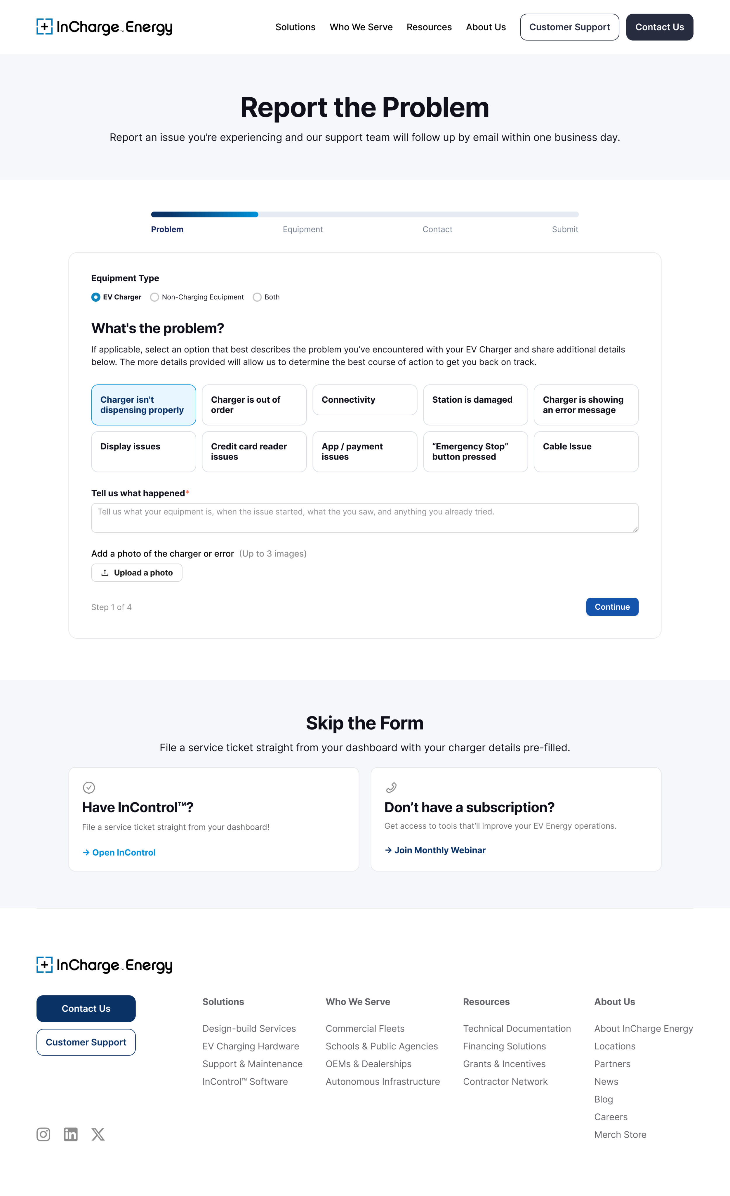
  • In the new flow, users describe the issue in Step 1; contact information is collected last, unlike the original form wherecontact information was collected first.
  • Removed self-rated urgency and redundant fields for less friction caused by multiple steps .

Step 2: Clear Case Details

  • Clear details for charger and location allows support to accurately and effectively create cases from the web support form.

Step 3: On Site Contact Reveal:

  • On-site contact handling: if a different person should meet the technician, the form reveals fields for that on-site contact, saving the support team a follow-up.

Step 4: Completion

  • Completed progress bar and checkmark to clearly communicate that the form has been completed.

Branding/Design System

  • Built a reusable step-progress component with a variant for each step.
  • Matched InCharge's brand system (navy #0F1729, electric blue #1554AD) and designed within the site's existing Divi build constraints.
  • Created a custom “electrical asset” icon in the Lucide icon style used across the product.

Impact

  • New flow leads with the problem, designed to reduce early abandonment
  • Routes other user groups away from this queue to their proper support path
  • Collects cleaner, structured case data by dividing the form into 4 sections.
  • Works responsively for mobile first users

Reflections / Considerations

This project strengthened my ability to reduce friction in a real environment. It allowed me to test my abilities to design within an existing brand system and platform, and balance user needs against support/operations needs. Iterating with my manager and presenting the work to other leadership strengthened how I frame design decisions around impact.

Back to Top