Overview
The LATech.org website redesign was a collaborative effort done by a team with my role being a lead UX/UI designer. We redesigned the LA Tech website to align with a new brand identity while improving navigation, content structure, and overall usability for students, partners, and volunteers.
This project is a current work in progress, building is yet to be done for this website.
Role
Co-Lead UX/UI Designer
Project Scope
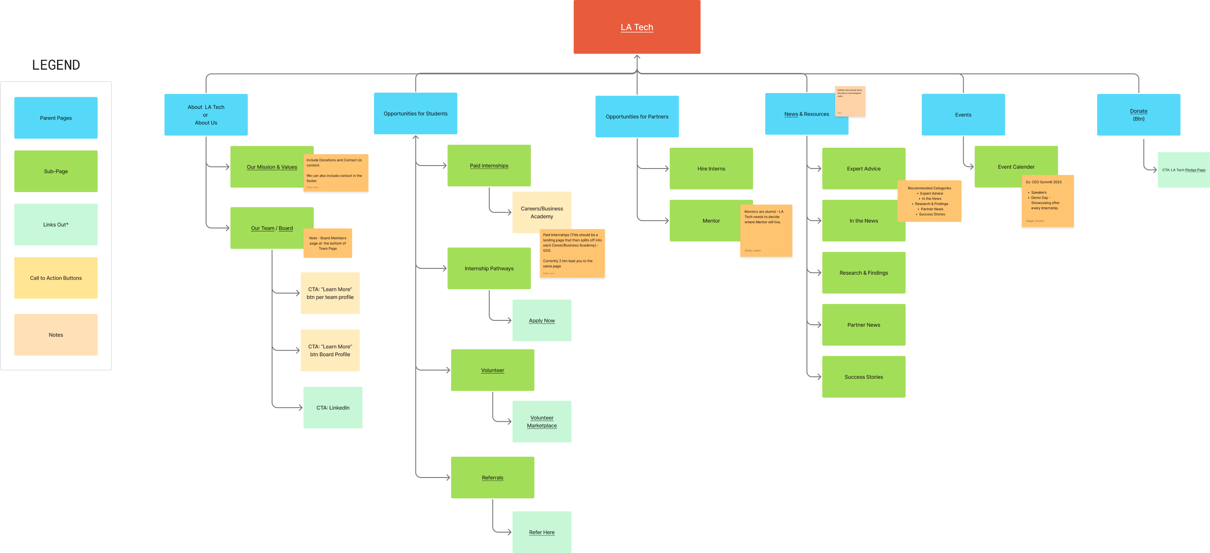
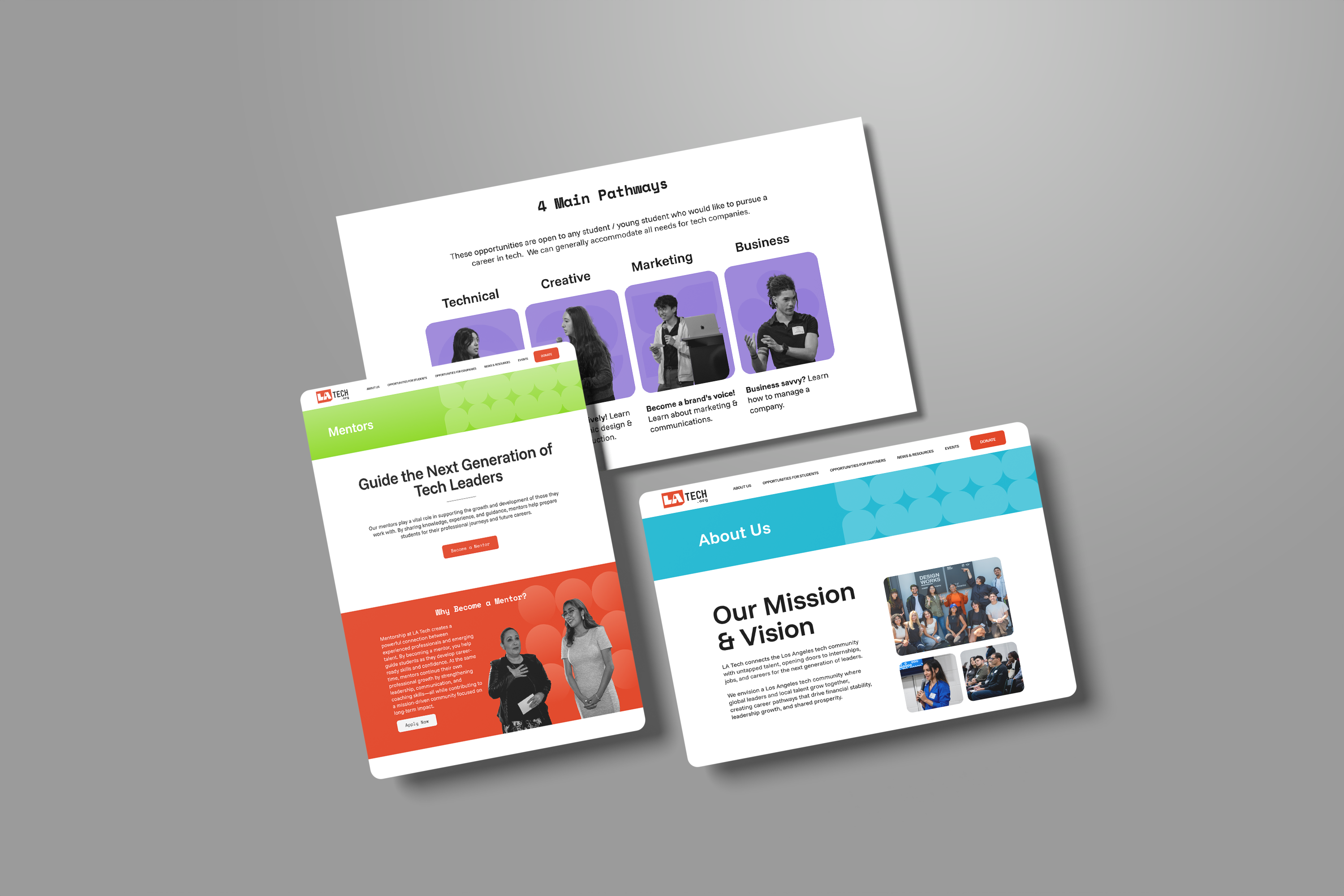
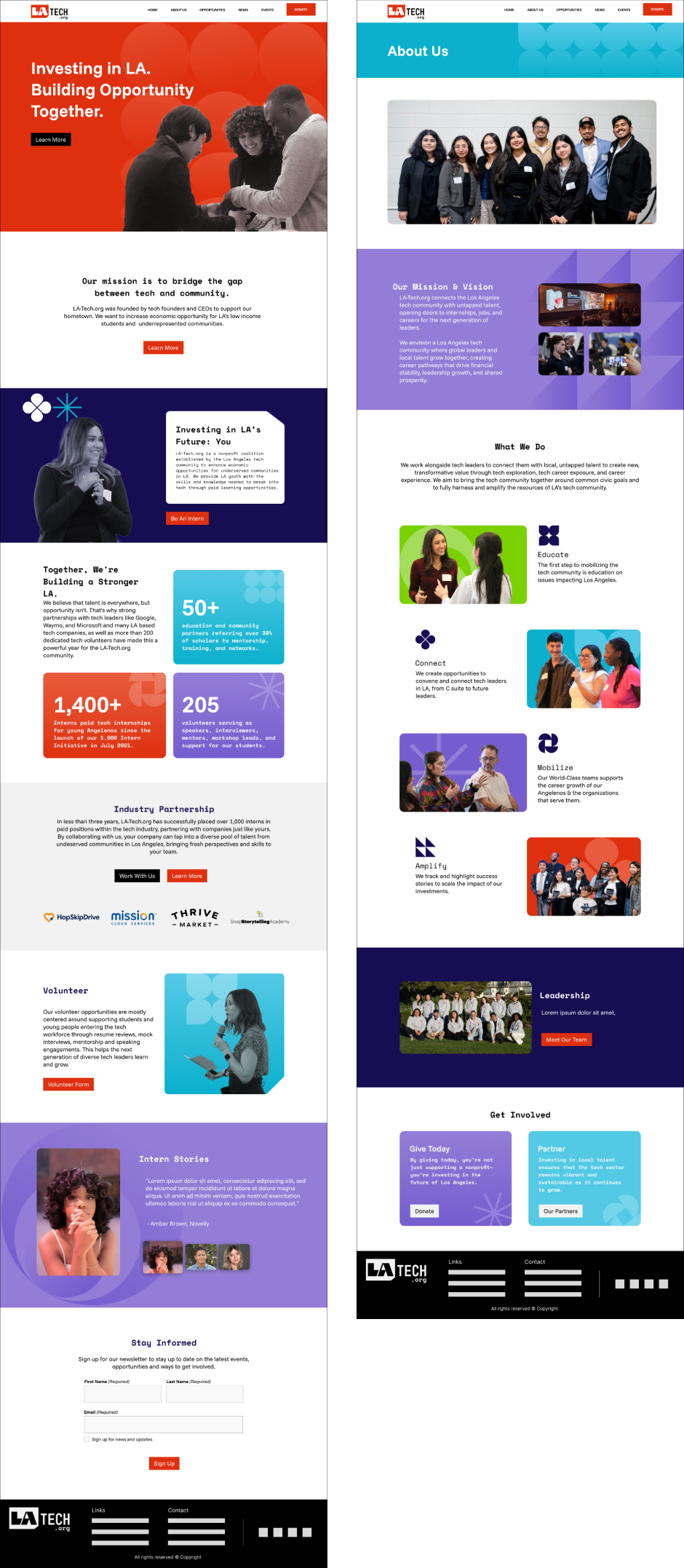
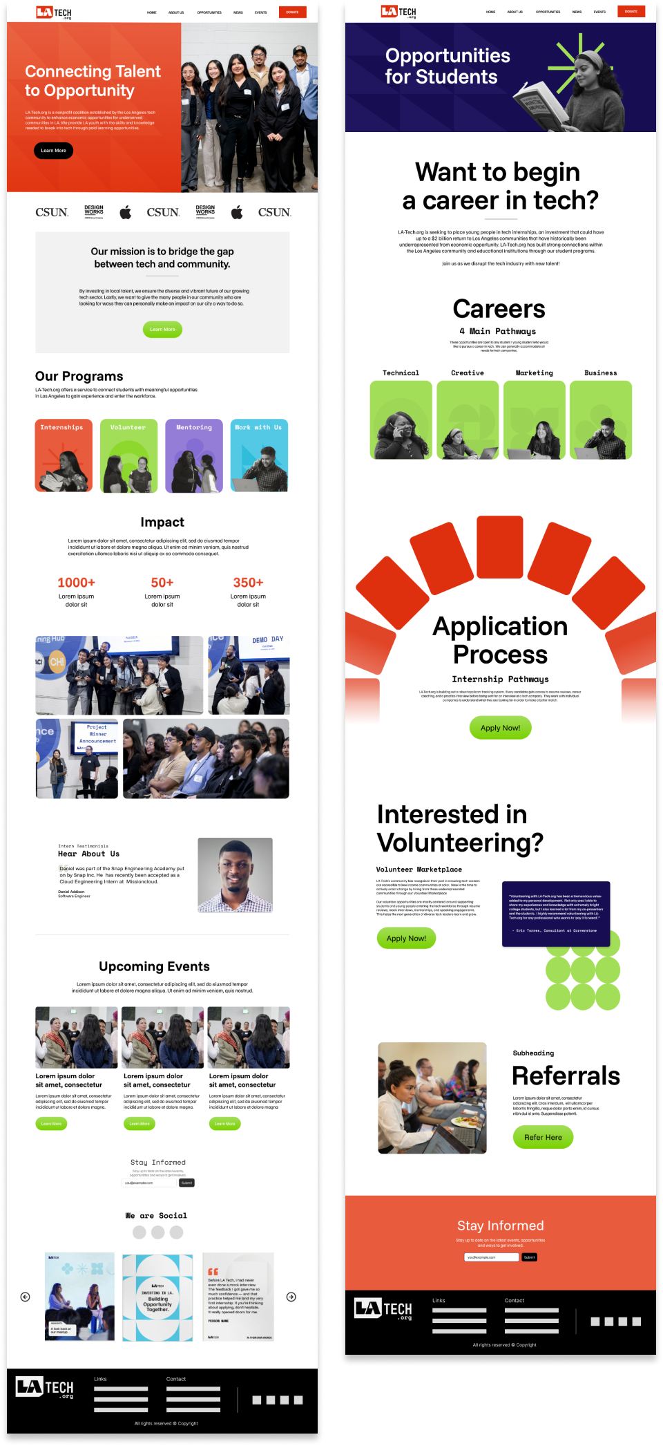
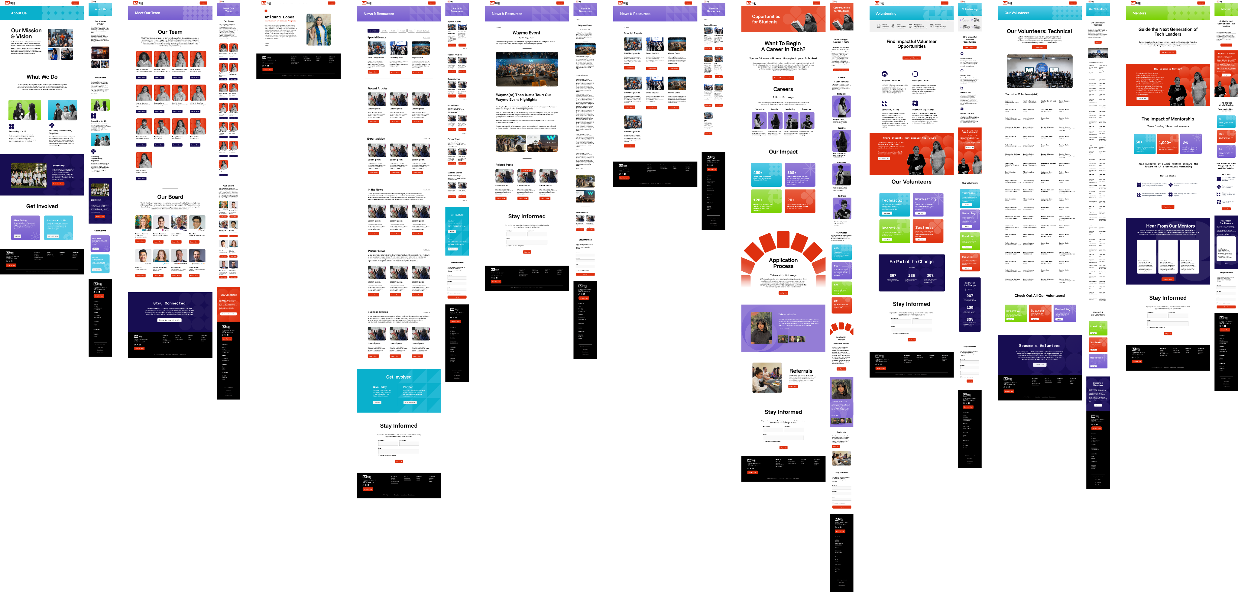
- Wireframing (Desktop and Mobile)
- Responsive Design
- Building with Wordpress