This persona guided design decisions by emphasizing the need to reduce physical effort and simplify repeated interactions.
Persona:
- Name: Lilly Thompson
- Age: 22
- Background: Senior in College, mobility issues
- Goals: using items with as little steps as possible
- Frustrations / Pain Points: repeated hand movements make mobility harder/reduces phone usage due to movement issues
- Relevant behaviors or habits: enjoys being outside of the house, enjoys using deals, uses apps for most purchases
- Why this user needs your new feature: Struggles with hand mobility, the screens are too many steps for a meal.

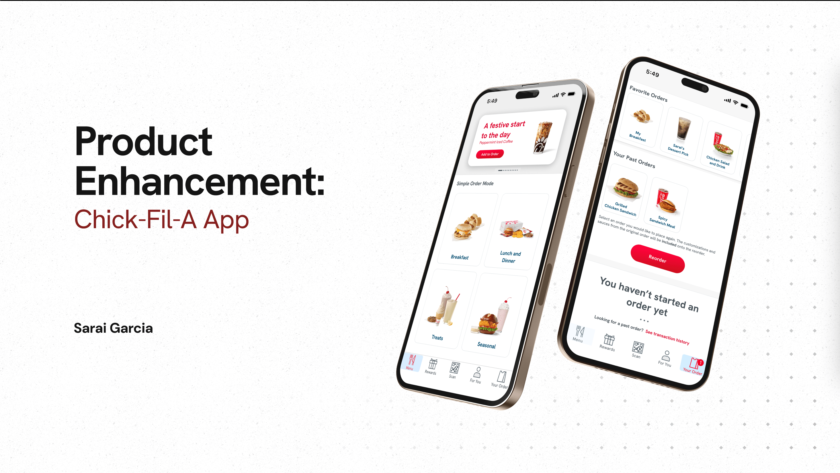
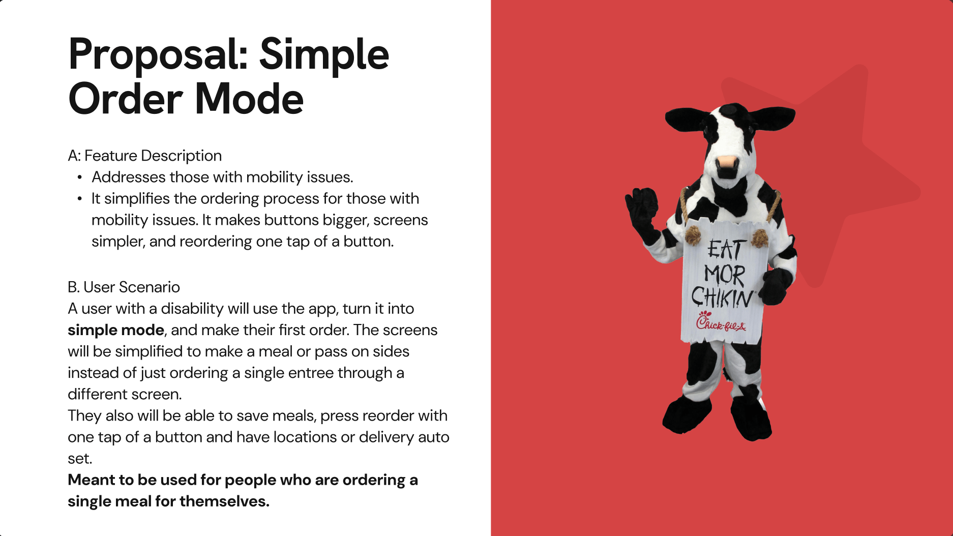
Design Solution: Simple Order Mode
Feature Description
- Addresses those with mobility issues.
- It simplifies the ordering process for those with mobility issues. It makes buttons bigger, screens simpler, and reordering one tap of a button.
User Scenario
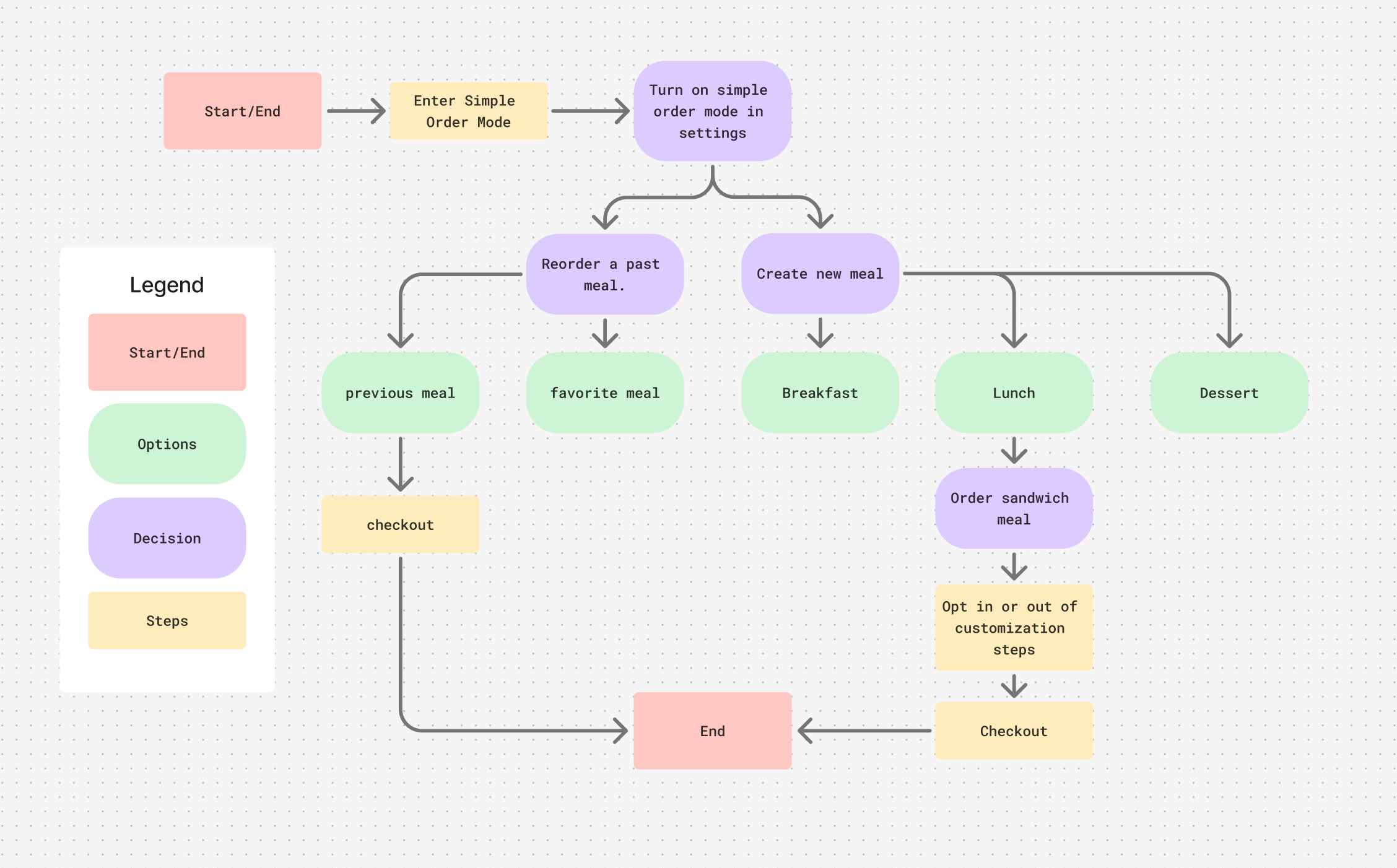
- A user will use the app, turn it into simple mode, and make their first order. The screens will be simplified to make a meal or pass on sides instead of just ordering a single entree through a different screen. Meant to be used for people who are ordering a single meal for themselves.
- They also will be able to save meals, press reorder with one tap of a button and have locations or delivery auto set.
This solution improves accessibility by minimizing repeated interactions and simplifying navigation, making the app more usable for a wider range of users.
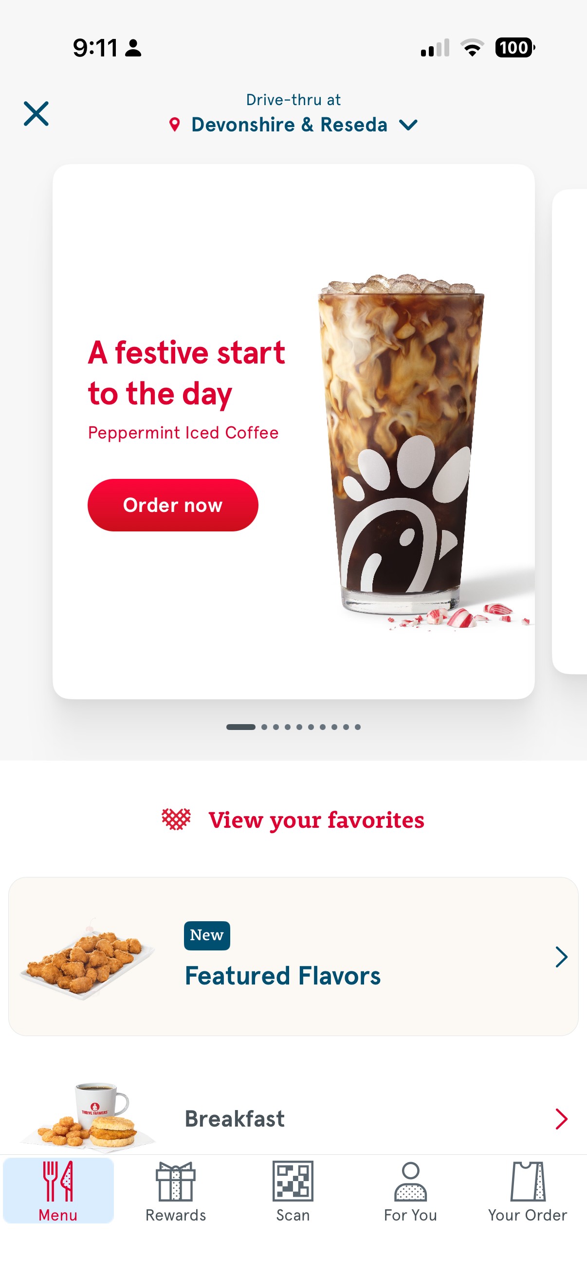
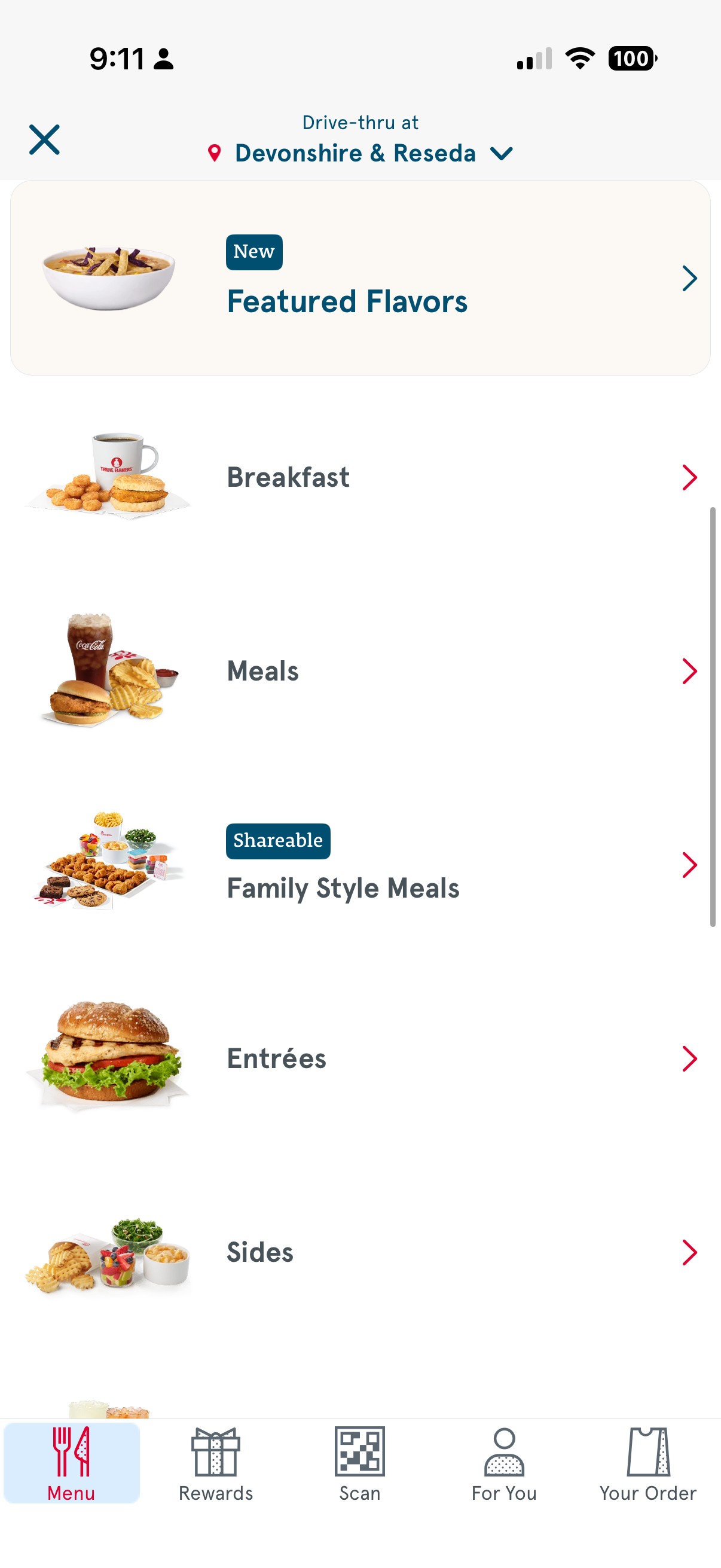
Wireframing
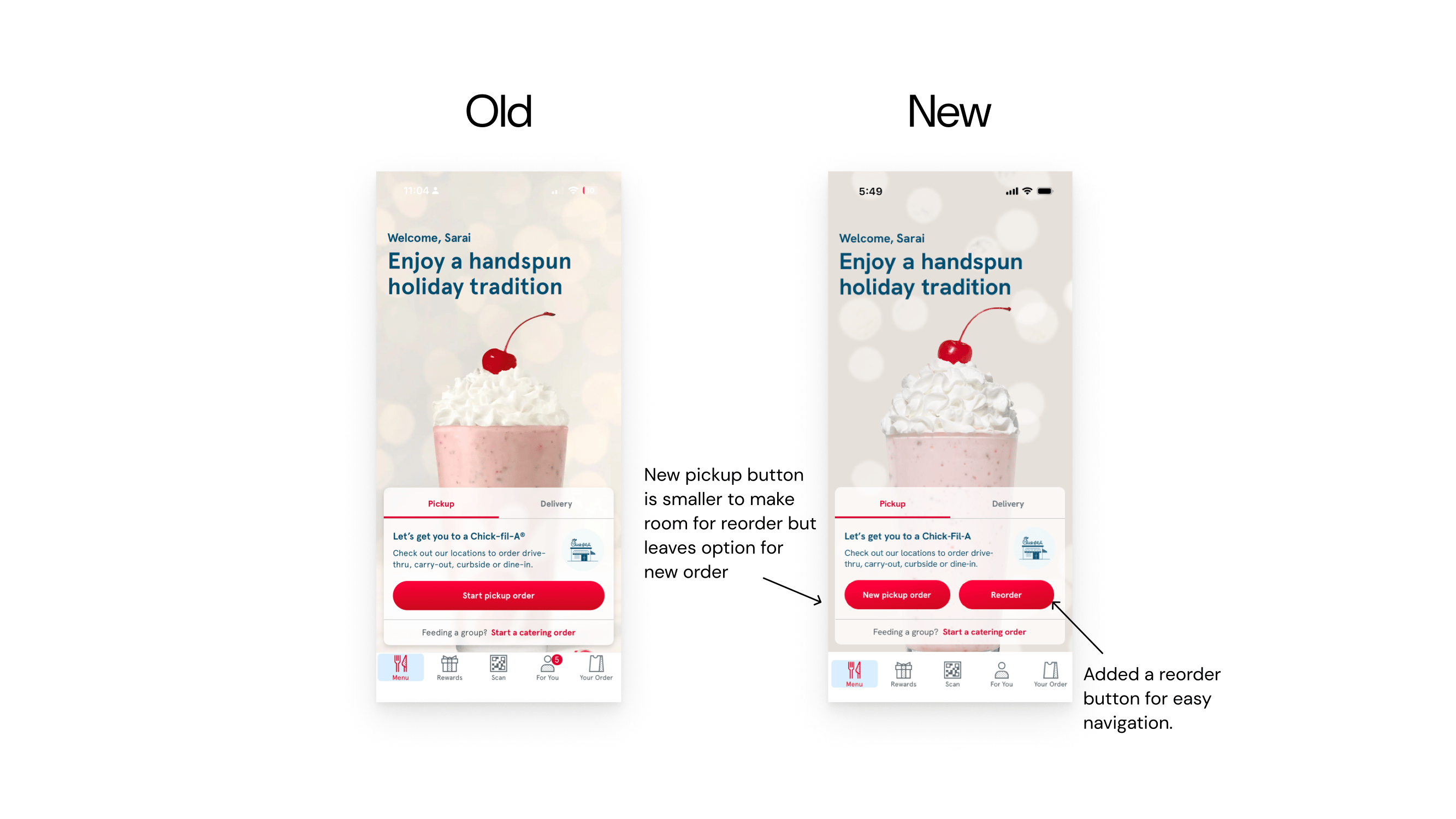
- Home Page
- Added a new button for reorder
- Reduces repeated interactions and simplify the ordering process for users with limited mobility.
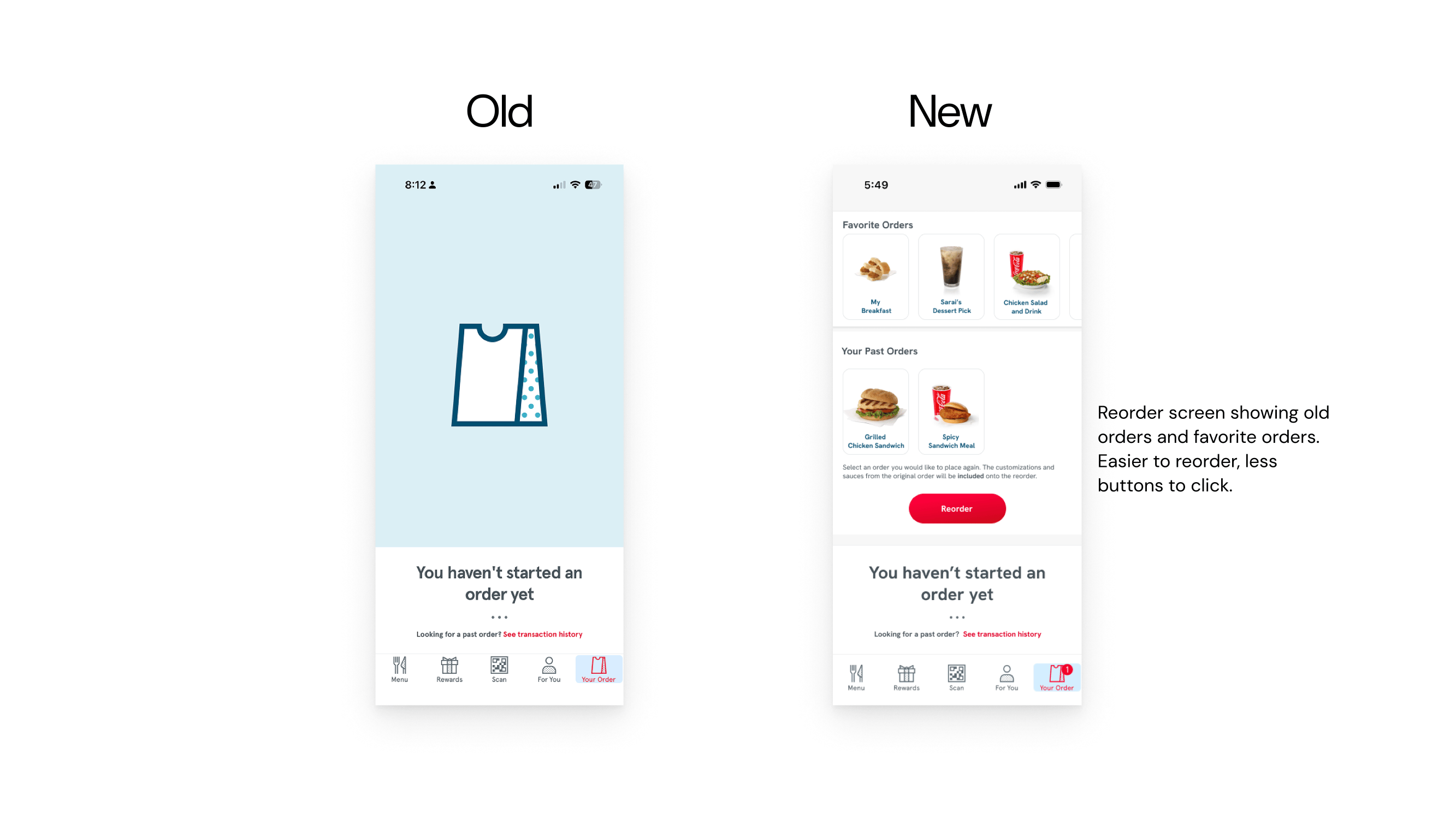
- Your Order Page
- Features past orders and favorited orders, so people can easily order.
- Aids those with mobility issues by requiring less steps to order their food.
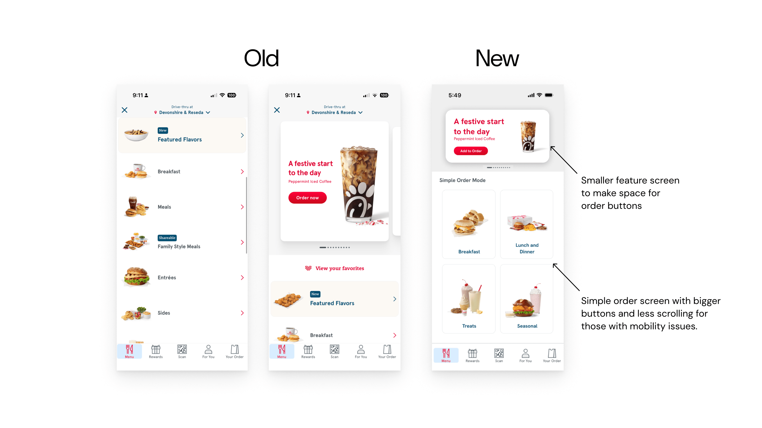
- Order Screen
- Shrank the header image to 1/3 of the screen to prevent scrolling for those creating a new order.
- Instead of rows, categories are now tiles with images to easily see items.
- Tiles show images for people who may have low vision and are unable to read the text.
- Opt out of scrolling through customization options with one click.
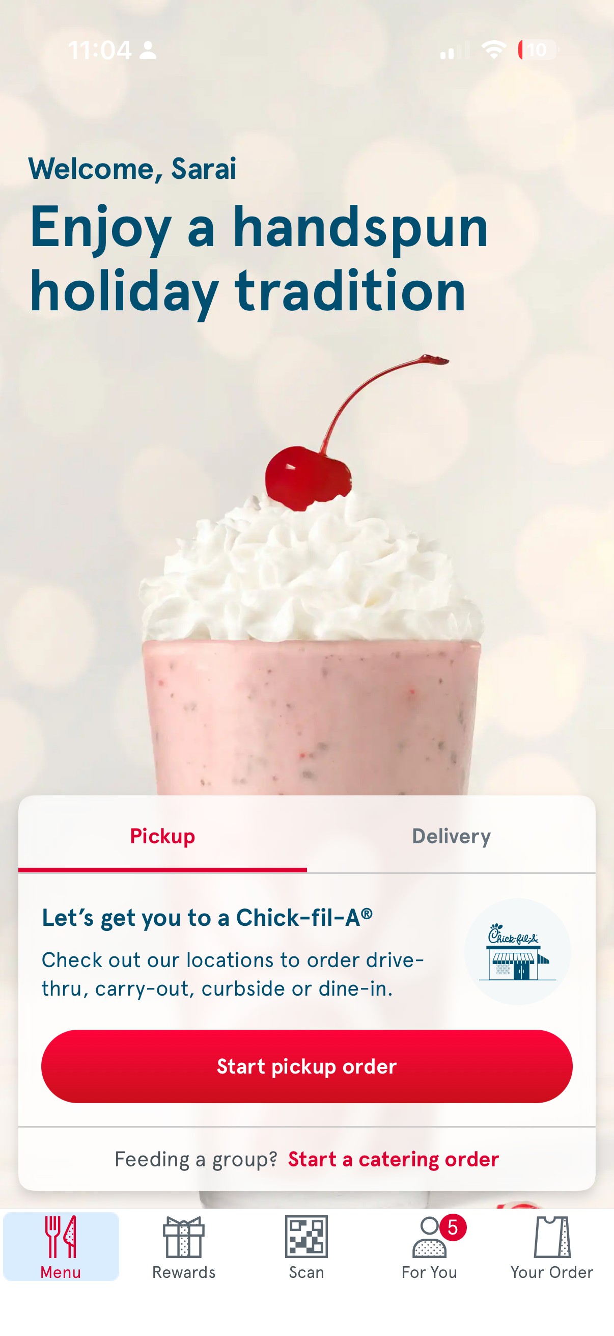
Home Page
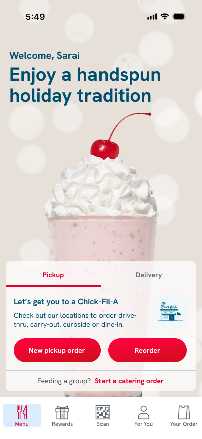


Added a reorder button for easy navigation.
New pickup button is smaller to make room for reorder but leaves option for new order
New
Your Order Page
Order Screen
Old
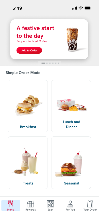

Simple order screen with bigger buttons and less scrolling for those with mobility issues.
Smaller feature screen to make space for order buttons
New
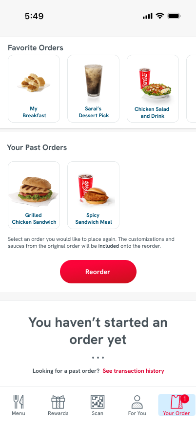
Reorder screen showing old orders and favorite orders. Easier to reorder, less buttons to click.
New
Old
Old
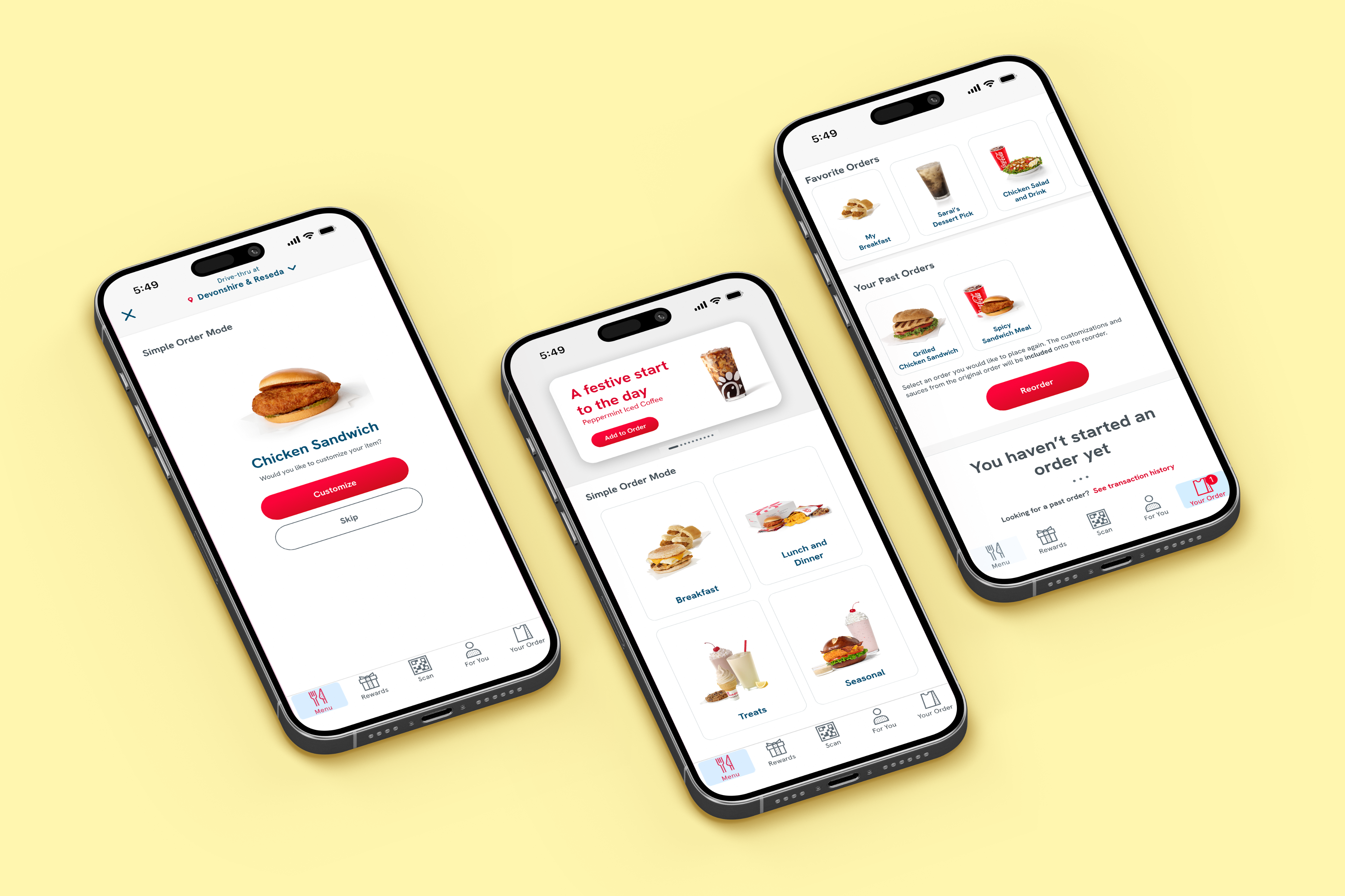
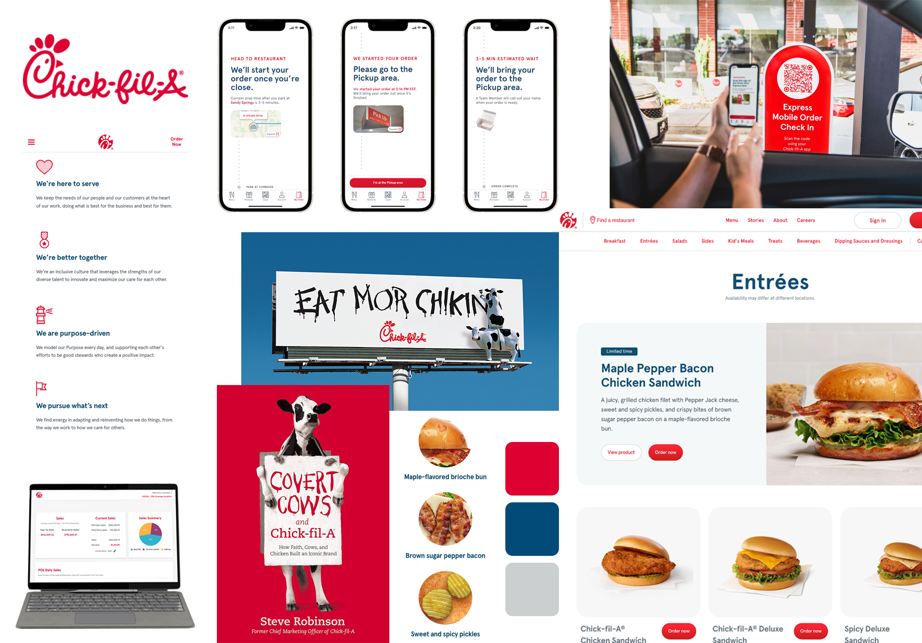
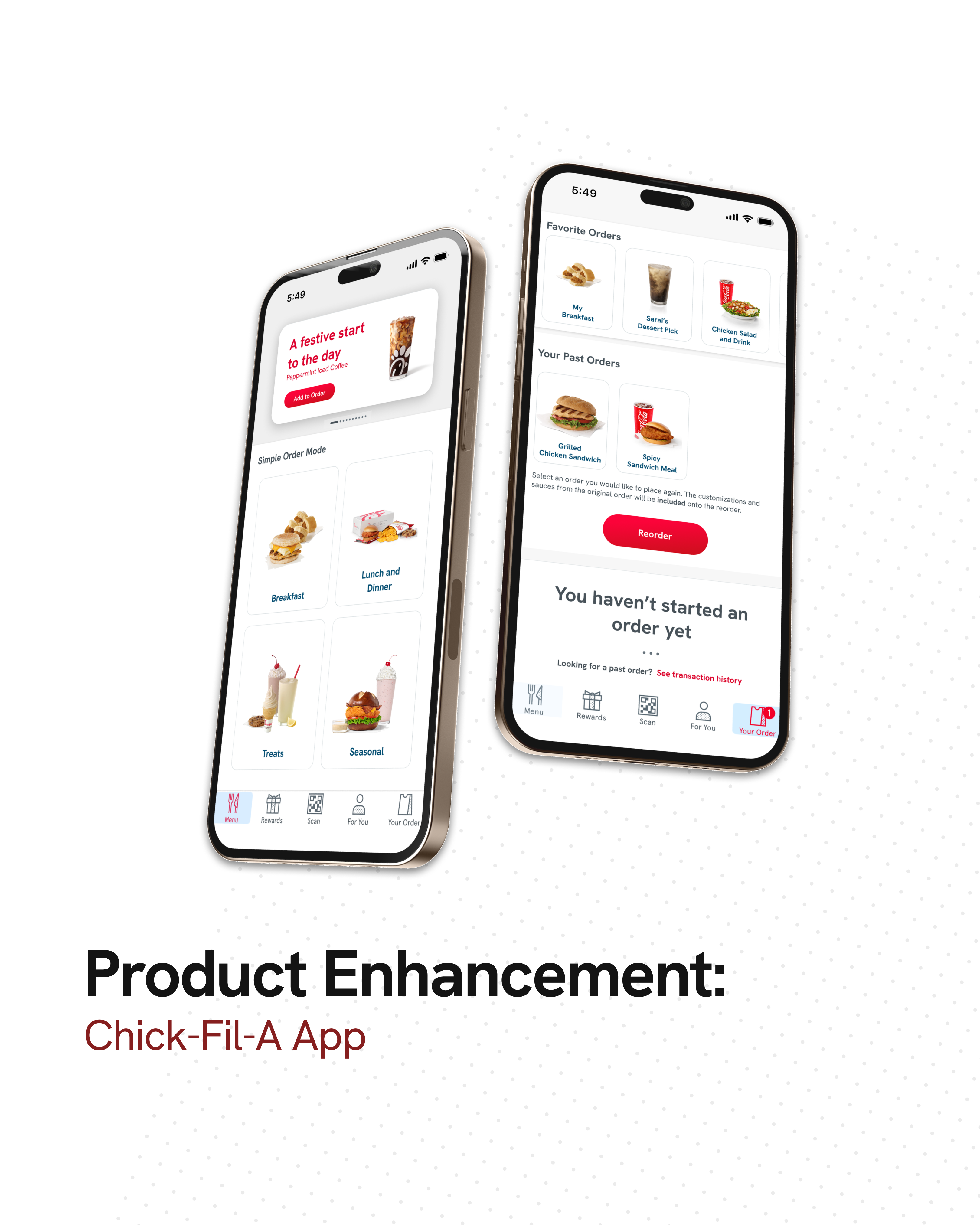
Finished Product